Tip the balance – Press ▲ or ▼


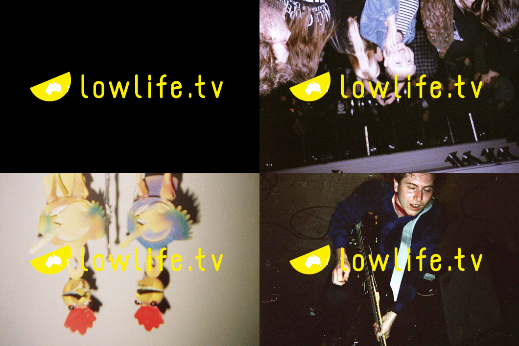
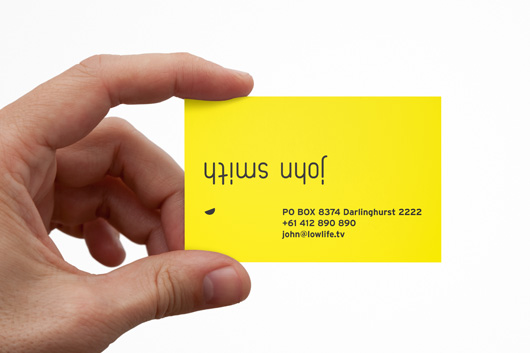
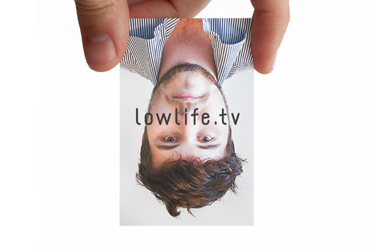
The videos are designed as openings and interludes in between long form content displayed on the site.

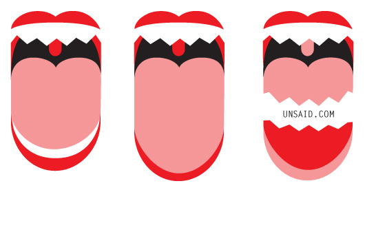
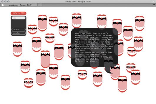
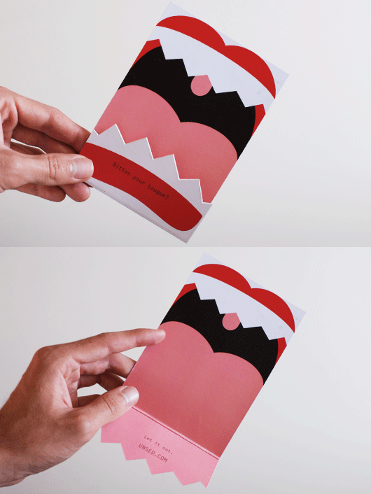
The aim with unsed.com is to expose the moments of ‘real-world’ clumsiness, and provide the user with a place to say exactly what needs to or needed to be said, exactly how it could be or should have been said.




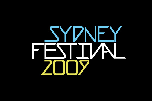
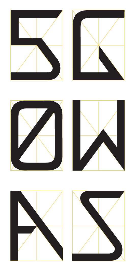
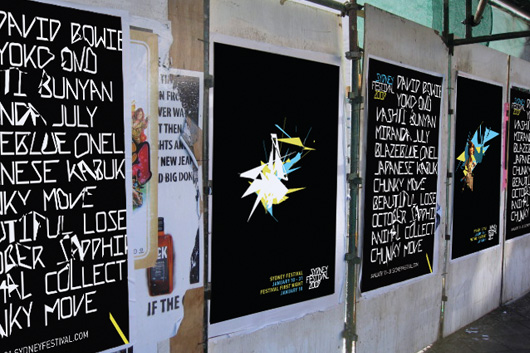
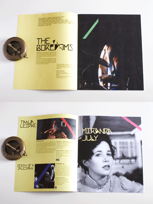
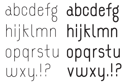
The base element of the branding for Sydney Festival is the custom typeface. The letter-forms adhere to a strict star shaped grid, which represents this ‘crossing of paths’ in which the magic of the festival takes place.

A powerful energy comes from the intersection of audiences and the diverse, entertaining and thought-provoking art that the festival brings to the city. This has inspired the erratic modular shapes and animation to break the conformity built into the typeface.
