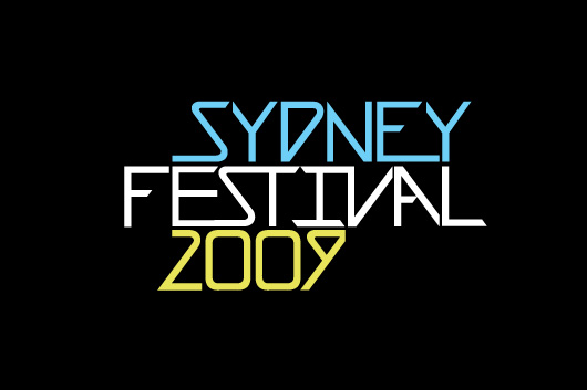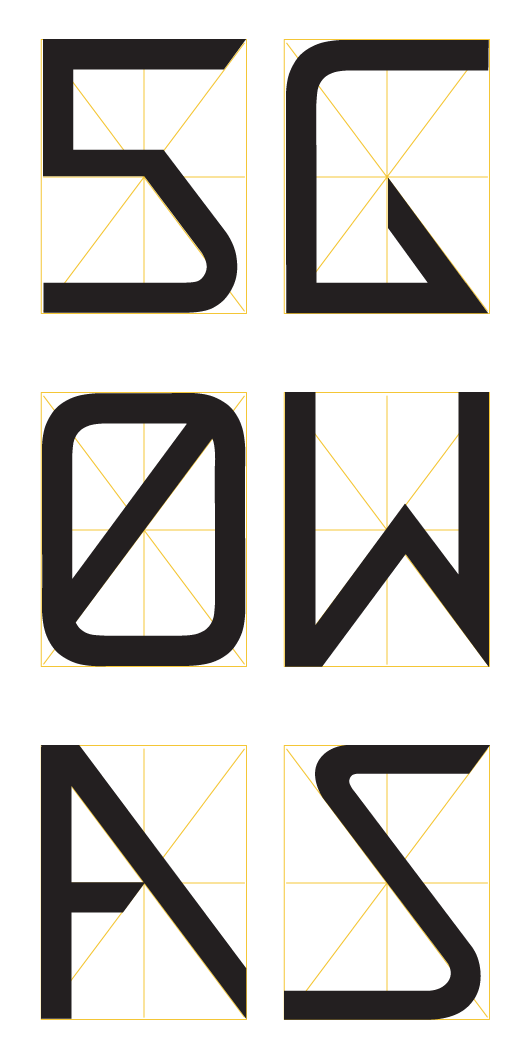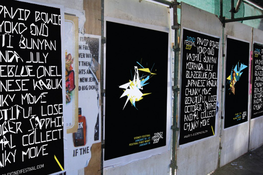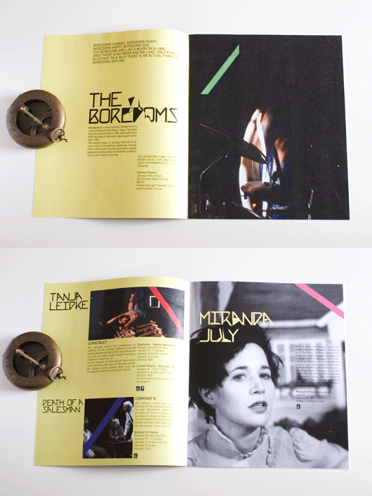

The base element of the branding for Sydney Festival is the custom typeface. The letter-forms adhere to a strict star shaped grid, which represents this ‘crossing of paths’ in which the magic of the festival takes place.

A powerful energy comes from the intersection of audiences and the diverse, entertaining and thought-provoking art that the festival brings to the city. This has inspired the erratic modular shapes and animation to break the conformity built into the typeface.


— Posted on by